Details
- Dimensions 14.9″ (w) x 20.8″ (h) x 9″ (d) / 380mm (w) x 530mm (h) x 230mm (d)
- Weight 1kg / 2.2lbs
- Volume 22 liters
Overview
Bellroy rose to notoriety with their first product, an insanely well-received slim leather wallet and came a long way since then.
I’ve seen the name pop up a few times here and there, but never quite with the same fan following as brands like Goruck or Tom Bihn. Luckily for me, the guys at UrbanCred, who have the same love for black, minimalist, technical travel-ready products as I do, gave me a chance to review the Classic Backpack Plus from bellroy.
Style
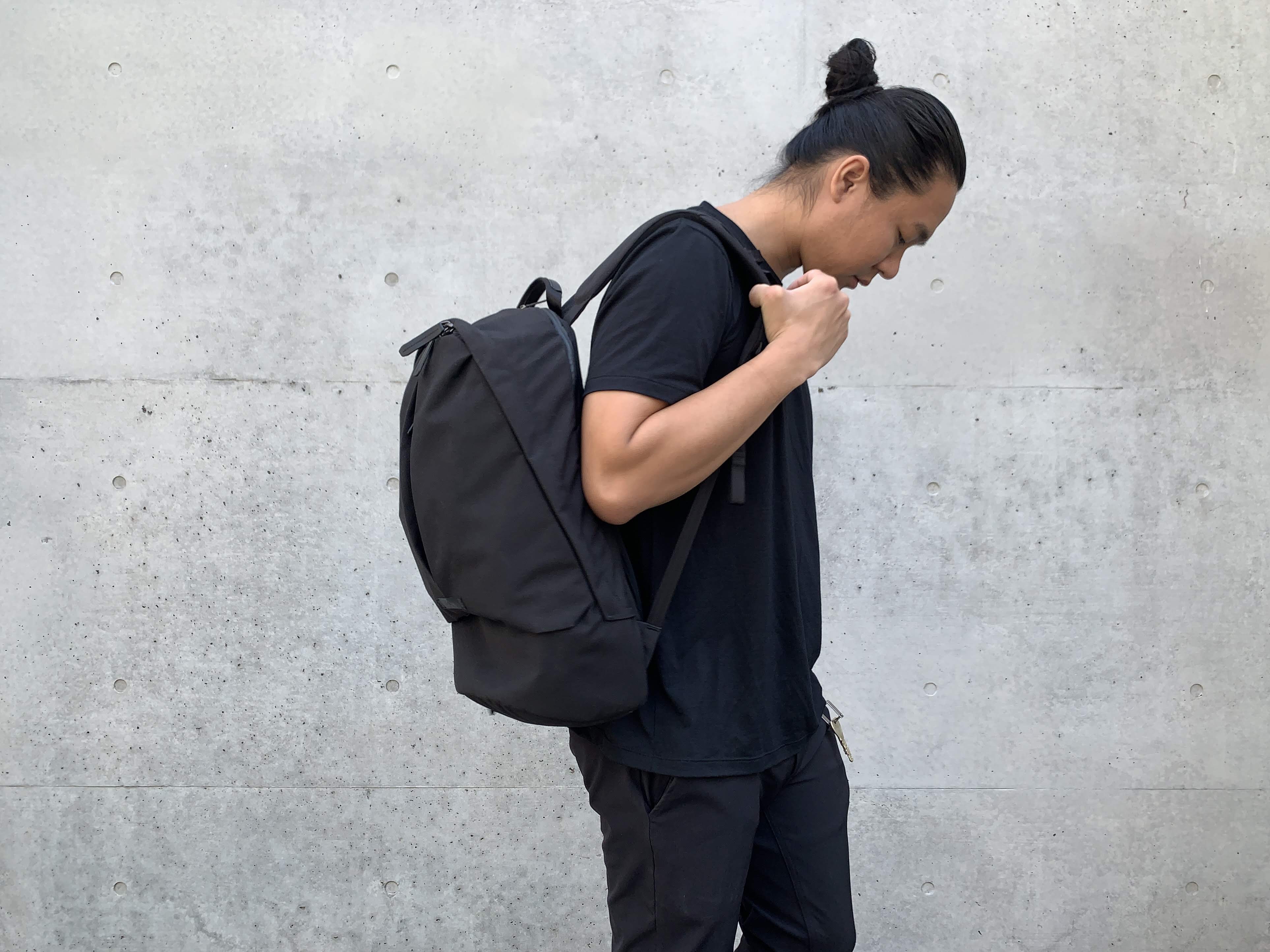
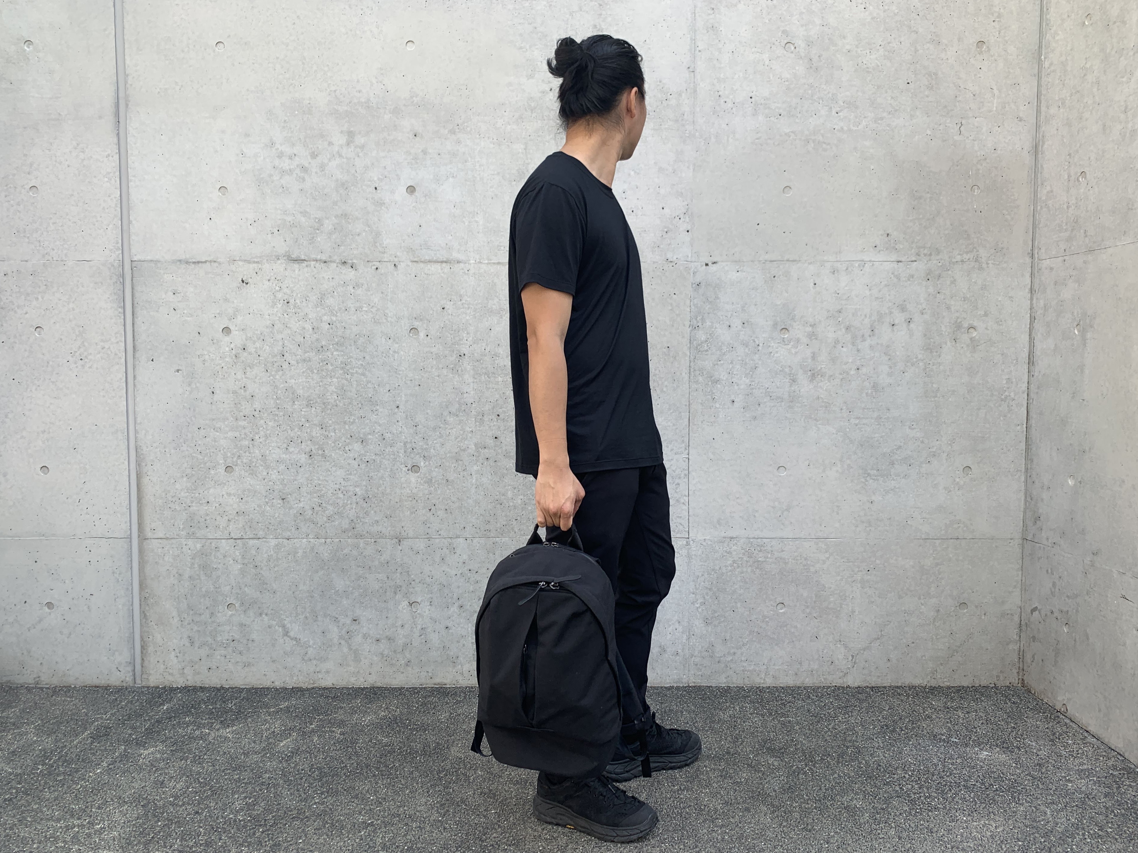
The Classic Backpack Plus was designed as a daily carry bag. Unlike bags like the Tom Bihn Synapse 25 aimed at the hardcore traveler, this bag is aimed at the urban dweller going about his day.
Take the train or ride your bike to work and then hit the gym after, this one bag is designed to look right in a variety of situations.
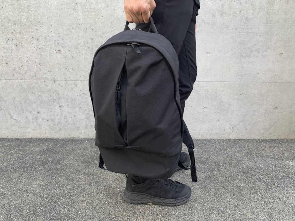
Since a few years ago, I’ve started wearing only black. While the bag comes in four colors, ash, black, neon cabernet, it’s no mystery which color I got.
When I first saw the product image, I was a little “meh”, but getting the bag in hand, I was surprised at the quality and style. I was impressed, to say the least, by my first impressions.
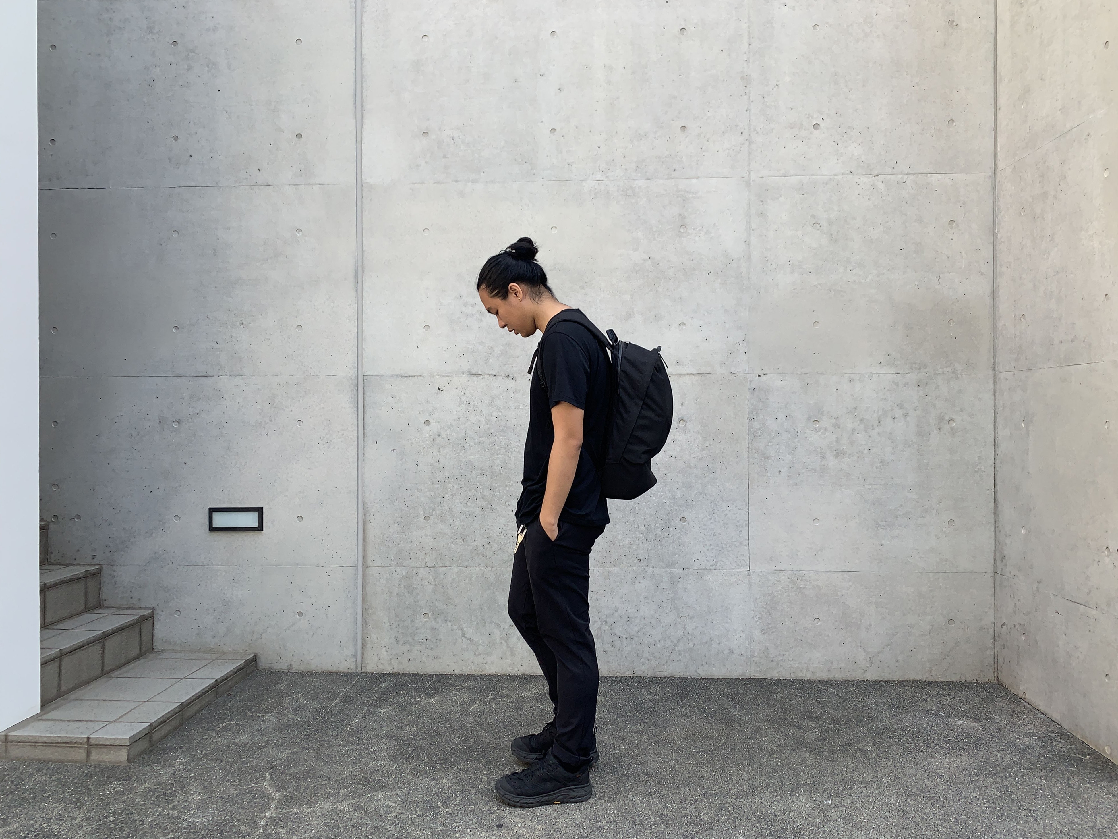
As a designer myself, I absolutely love consistency, and if you try to include many unnecessary details, the product often looks cluttered or untidy.
With the exception of the branding tag, the Classic Backpack Plus’s material is kept the same throughout the front of the bag, so it looks cohesive and aesthetically whole.
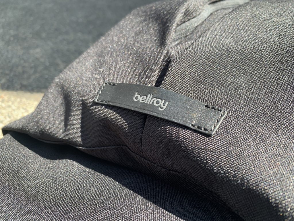
Even with the branding tag, the logo is muted down to black. While I generally prefer there to be no branding on my belongings at all, I’m generally accepting if the branding is either very subtle or look really rad.
The material is rough to the touch and there is a very interesting texture to it. I usually don’t like a my backpacks’ fabric being rough but this somehow just works.
Unlike travel bags with excessive straps and pockets, the backpack is sleek with little visible details. There is literally just two slots, making an inverted T, on the front of the bag.
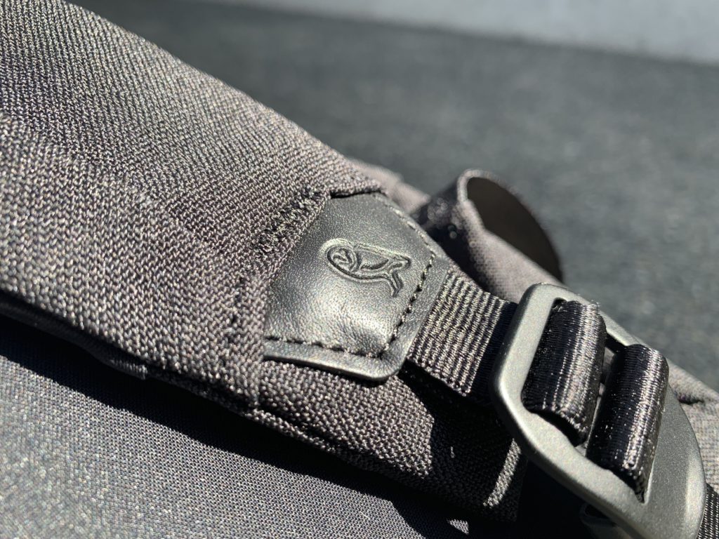
As expected from Bellroy, the bag is accented with high-quality leather they are known for, for that little bit of lux that a high-end urban commuter should have. That leather is used on the branding on the front of the bag, a single tag with an debossed “bellroy”, and the strap, which is debossed with an “owl logo”. Classy.
On the insides, there is a brownish sand color lining, that surprisingly looked a lot more elegant than I expected, even though I tend to favor black unfairly.
The bag is a smart-looking and ultra clean. While not as minimal as, say, the Veliance Nomin Pack, it’s is definitely more than minimal enough for your average digital nomad.
Material
This is the first time I’ve heard of venture-weave polyester. In an industry packed with “household materials” like Cordura and Ballistic Nylon, going with a unique fabric like this can be quite the risk, but at the same time could allow you to stand out from the crowd.
Venture Weave is a specially developed super-tight weave of polyester for extra durability and texture. While polyester is slightly less durable than nylon, this special weave is more than enough for the purpose of this bag, which is daily carry.
Polyester itself is waterproof, but weaving it together into a fabric will result in air gaps that allow water to go through. That’s why the super-tight weave of this particular material is key to increasing the water resistance.
The material, just my touch, feels super durable because of the rough, and even a little crunchy, texture.
The leather used to accent the bag is called ‘environmentally-certified leather’ by Bellroy. This is because the leather is vegetable-tanned by gold-rated LWG (Leather Working Group) tanneries.
It’s usually hard to achieve a gold rating for these tanneries because of the high amount of electricity and water required for the process, but Bellroy has been particular about their responsibilities to the environment.
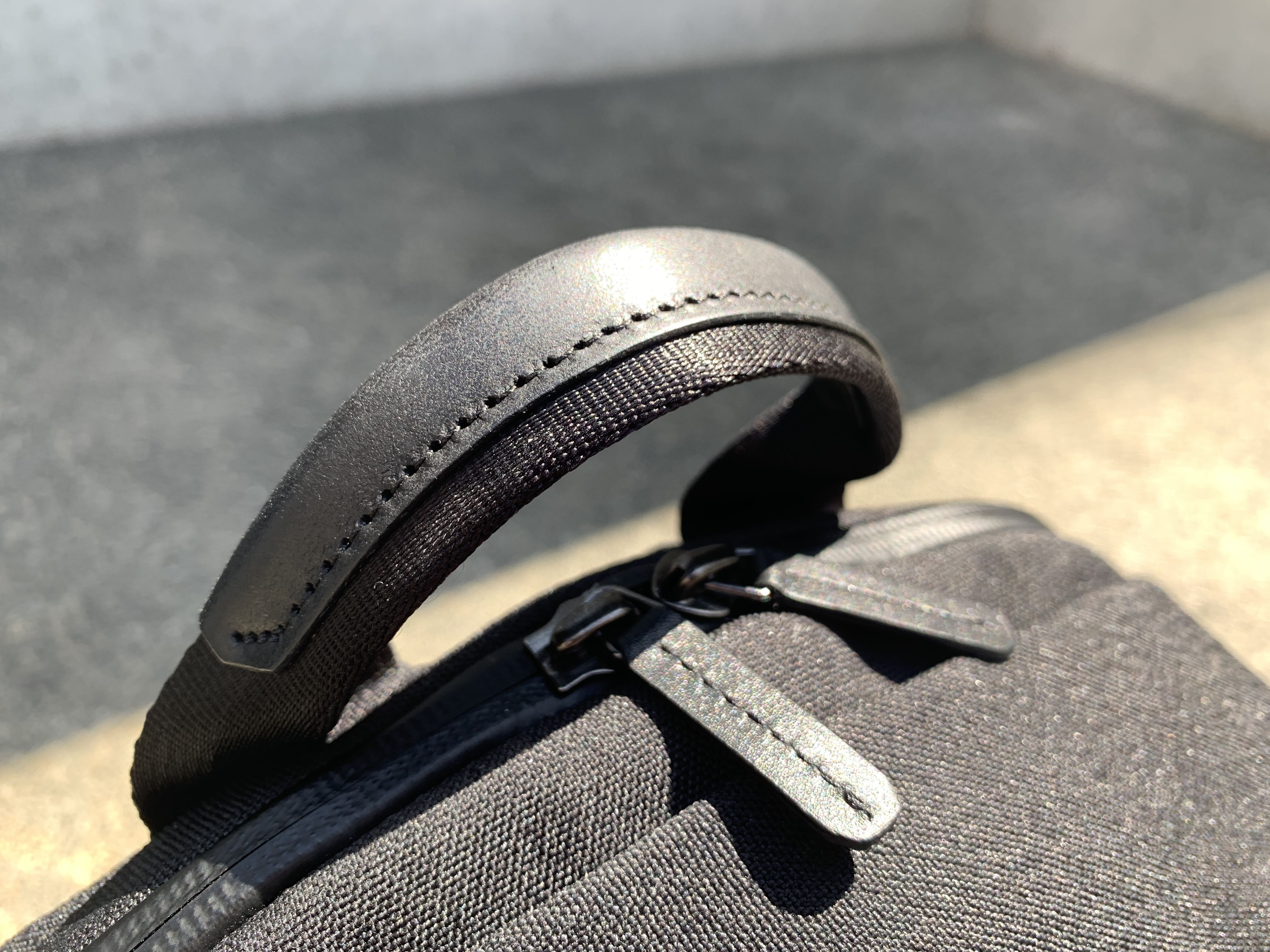
On top of the vegetable-tanning which gives a beautiful finish that develops a beautiful patina over time, some chrome-tanning element is required to make it more durable, softer and looking new for longer.
All the zippers are from the obvious choice, the one, and only YKK. They do take it a step beyond for the laptop compartment and the top quick-access pocket with the waterproof Aquaguard zips to protect your precious gadgets.
Organization
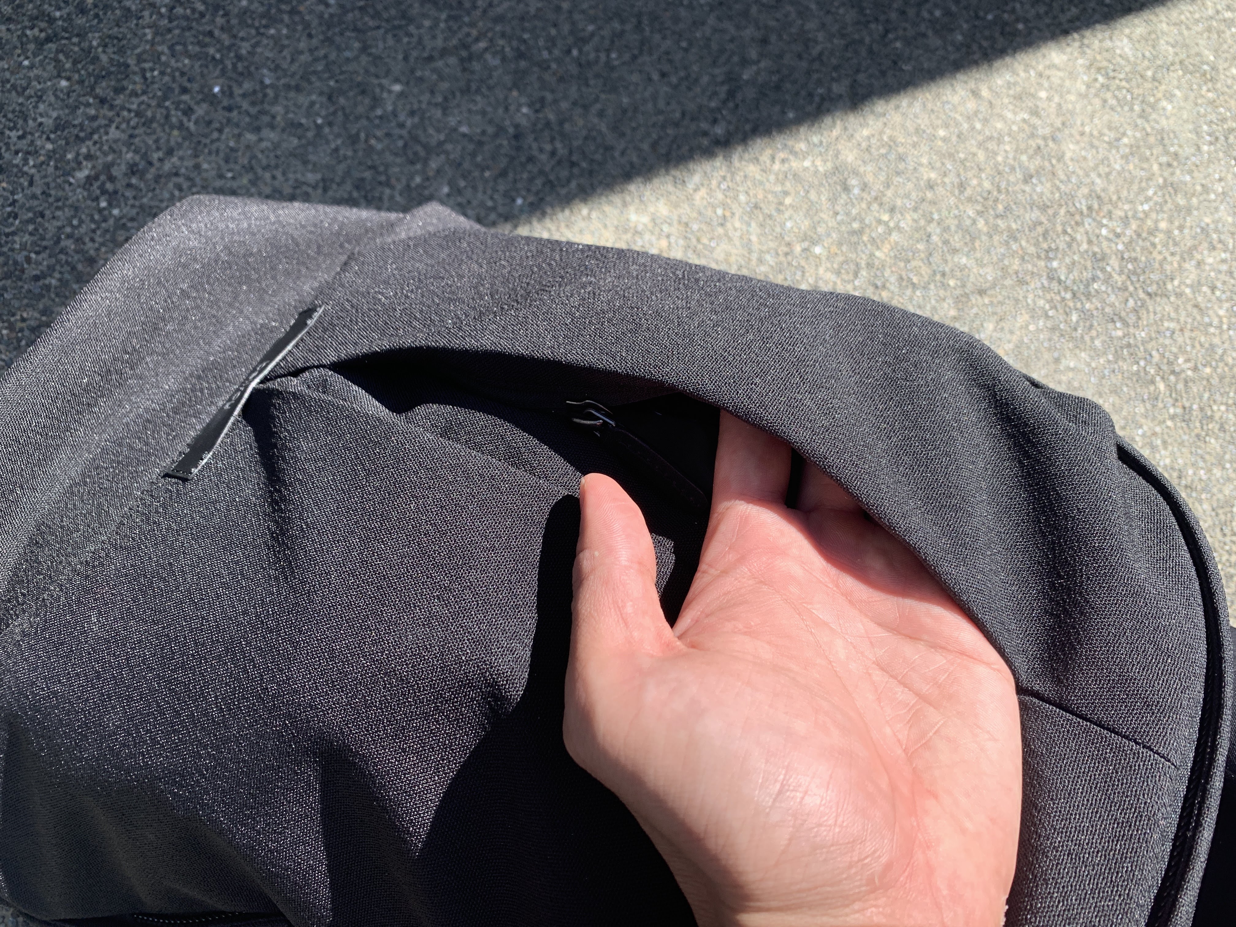
On the outside of the bag, there is a quick access compartment if you open the zip down the middle front of the bag. Even though the front of the bag is visually split into two, only the left side of the bag has a quick access pocket.
While this pocket can fit things like a cardholder or keys well, it’s narrow that it couldn’t fit in my employee pass in its leather case.
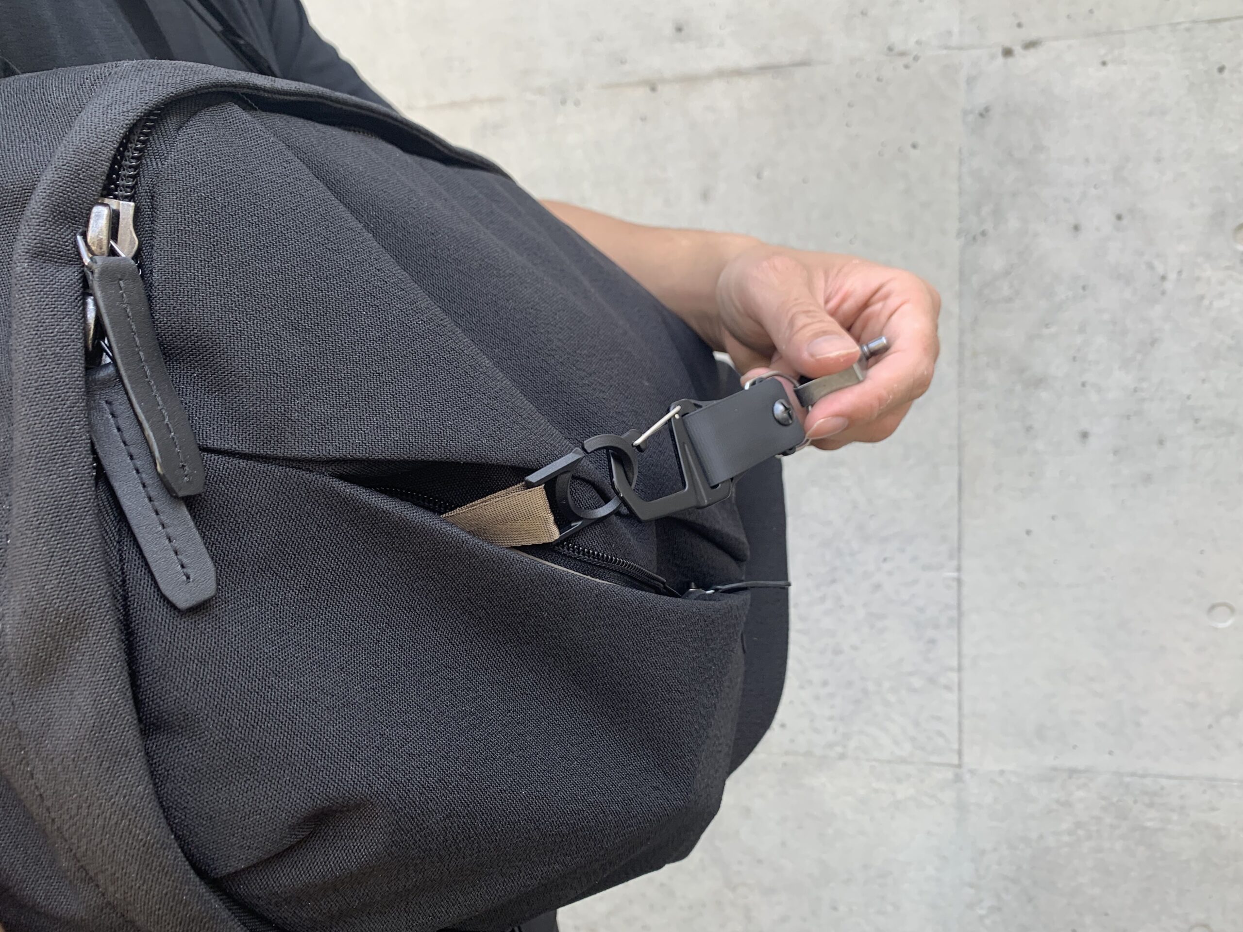
There is also a key ring attached in this pocket. The way you can attached the key onto this ring through a small slit in the ring itself, is one of the details that make me like this bag so much.
Since I was used to the configuration of TOM BIHN’s Synapse 25, I was wondering why there wasn’t pockets on the right and bottom sections on the front of the bag. I’m guessing they want to keep it low profile because an overstuffed backpack can’t be sexy-looking.
The main compartment is much more spacious than I expected. Right near the top, there is a deep pocket, that has a very fine mesh on the top area. The mesh can’t really be seen through and is there for its elasticity so you can open it wider when putting in larger objects.
I put a bunch of pouches that I use to group certain types of everyday carry as well as my sunglasses case in there.
In the open part of the main compartment, there is a slot to put your water bottle in. I was able to easily fit my 1 liter SIGG water bottle into it.
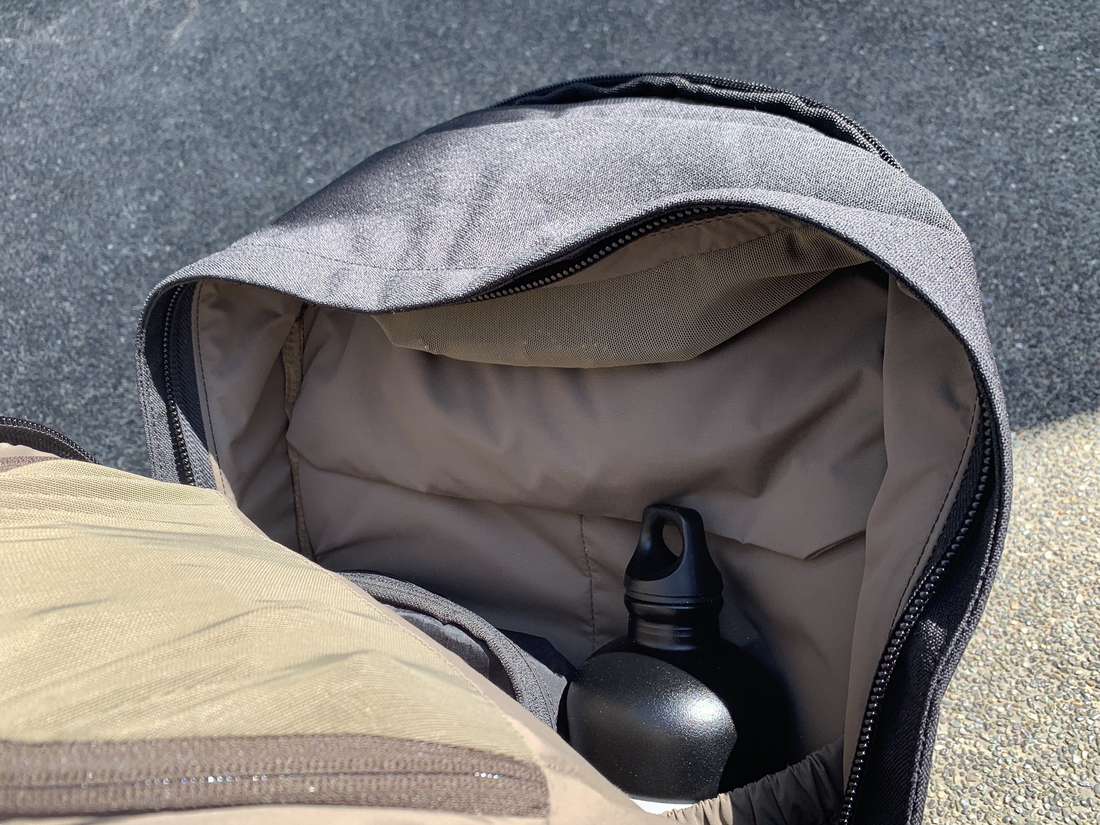
The laptop compartment is also another design marvel. It was able to fit my 15-inch Macbook Pro, way more snug than my other backpacks, leaving you never feeling like it would ever fall out.
On the top part of the inside of this compartment, there is also another mesh zipper pocket that is probably designed for your laptop accessories.
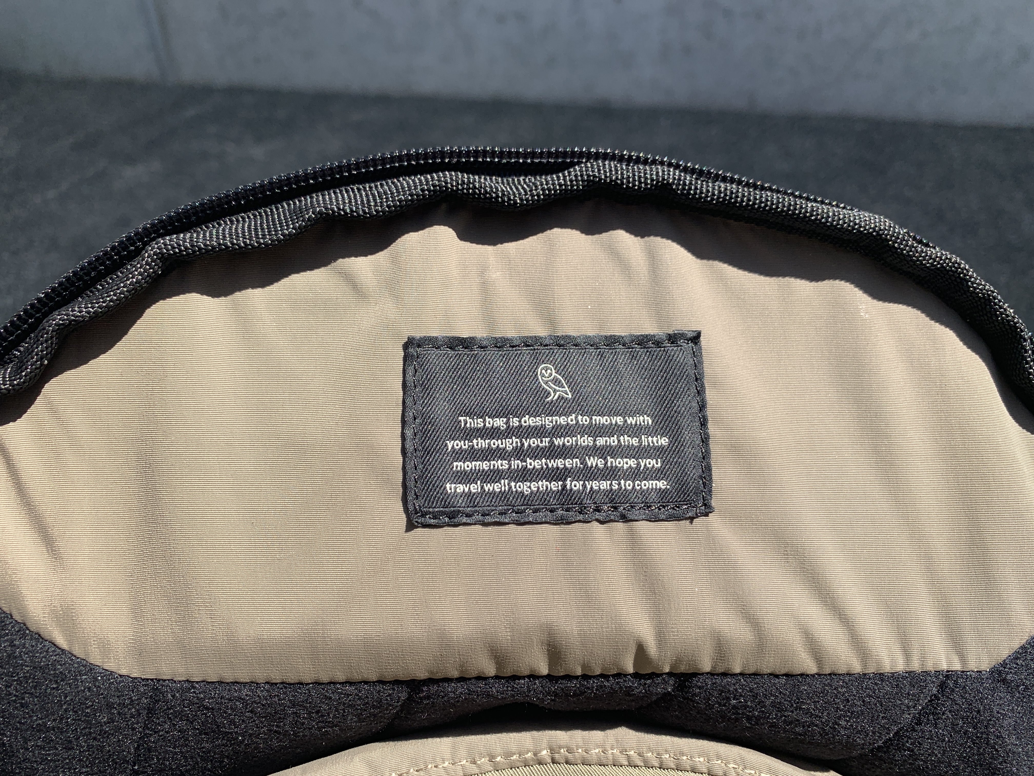
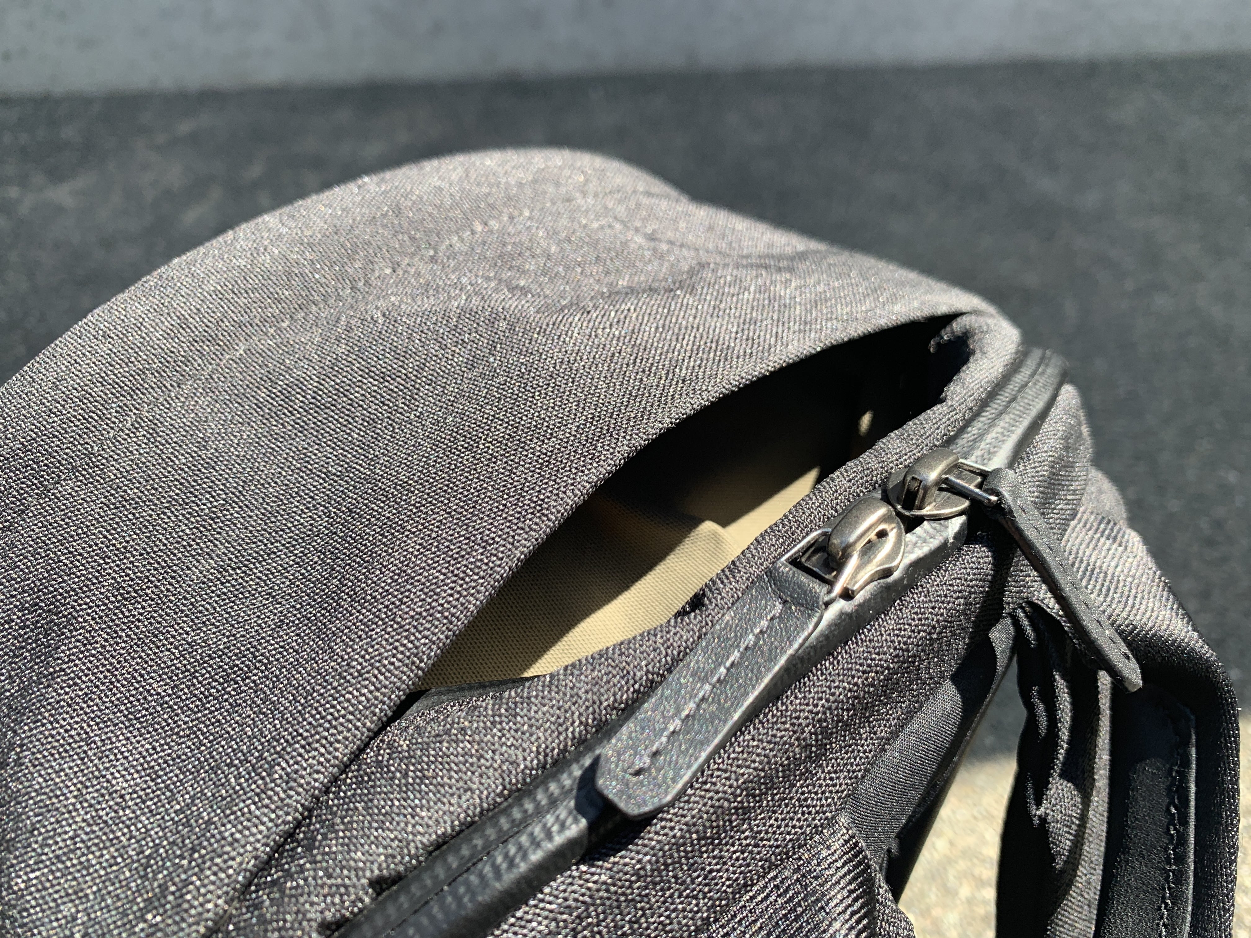
On top of the bag, there is another quick-access pocket. This pocket is so hidden, that I didn’t spot it after a whole day using it. It’s much smaller than quick access pocket in front.
It’s also less easy to access (but still really awesome) because the zipper doesn’t have a zipper pull like the pocket in front.
Usage
This bag has given me quite a bit of pleasant surprises. I’ve been using as a daily carry bag to the office, and enjoy every moment of it (I’m not obsessive, I swear).
After transferring all my belongings from my Synapse 25, I could clearly feel that the way the organization was designed made it feel a lot more spacious, despite being 3 liters lesser in volume.
I think it’s mainly because of the ingenious use of stretch pockets, so pockets only take up as much space as their contents.
Another surprise came from the fact that it was so much more comfortable to carry around.
While I could feel the pressure on my shoulders with my Synapse 25, this bag’s shoulder strap paddings and ergonomic, slightly curved lumbar padding make the bag feel much lighter than it actually is.
The quick-access pocket on the front of the bag is also another design point that I love. When your bag is slinging off one shoulder, the direction of the zip is just the right orientation for you to easily unzip. Even as a user experience designer myself, I was impressed. This shows that Bellroy knows their customer’s natural behavior well and have probably tested the bag sufficiently.
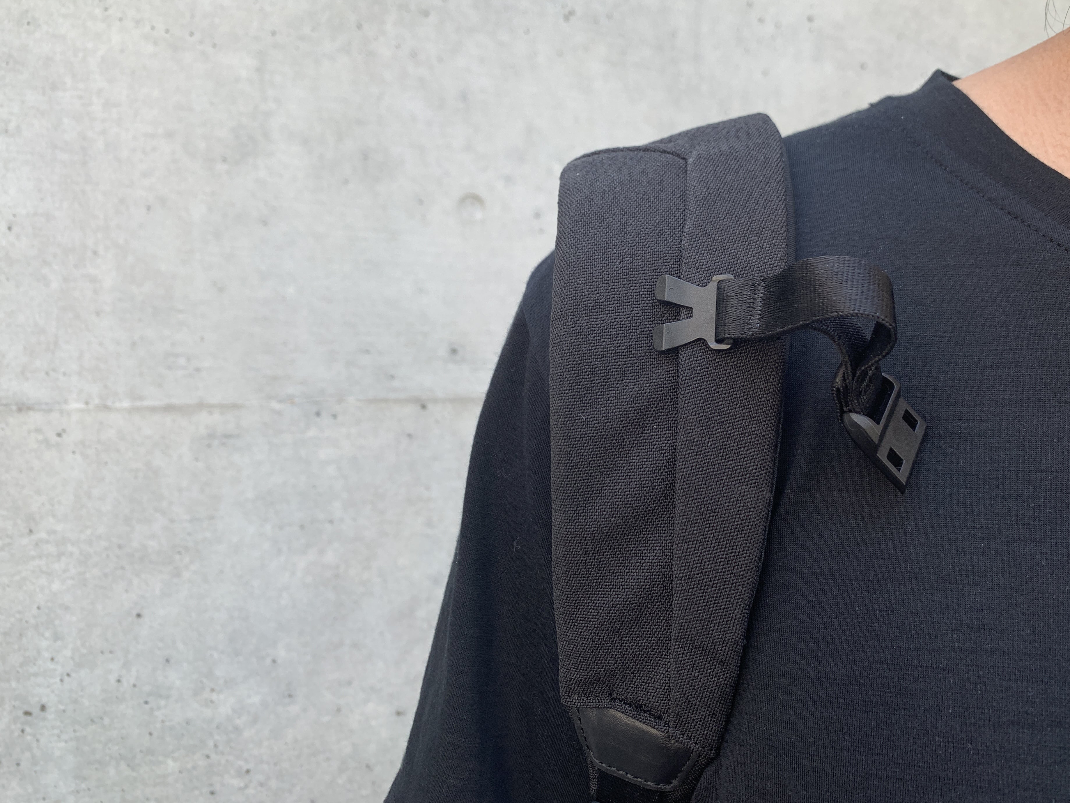
The sternum strap also has a unique design. The way it works is not like the usual clips, where you have to press both sides to free the clip. But you sorta just hook it together and it stays that way with a magnet.
This way is actually way more secure than it seems, and you can only open it by pushing both sides of the clip in the opposite direction. It’s pretty addictive to use.
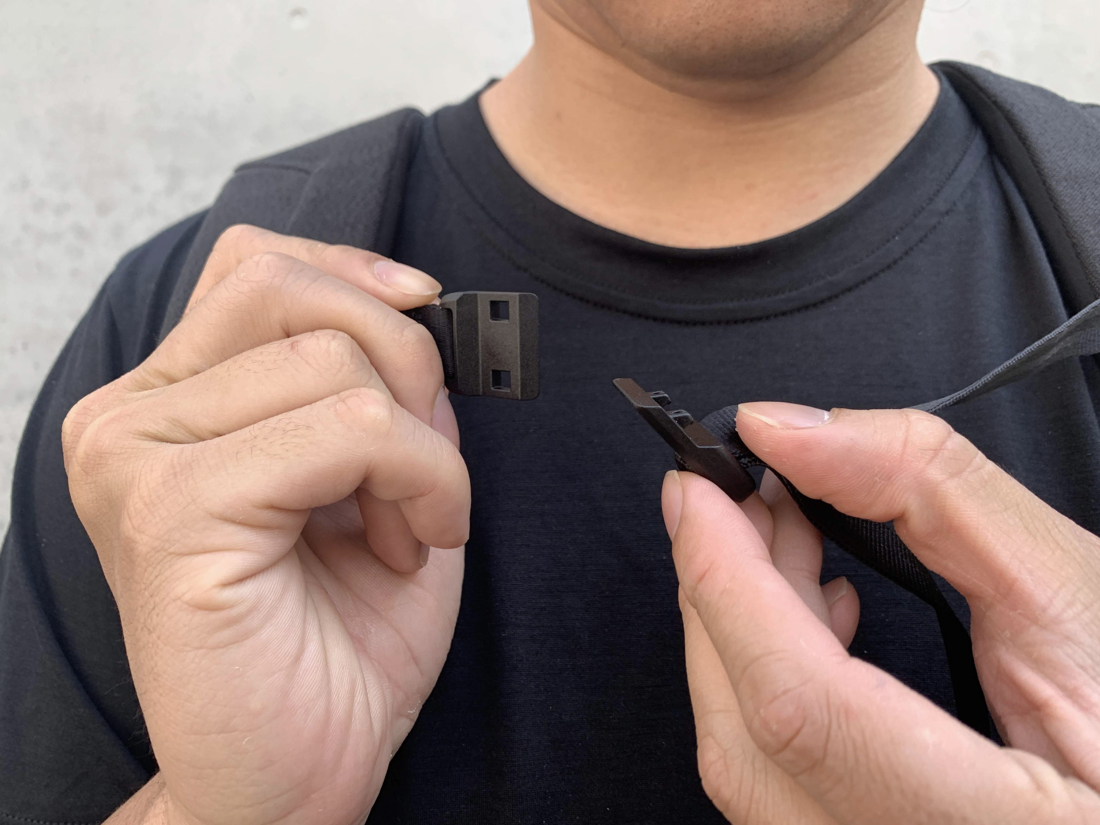
The sternum strap is connected to the bag by a clip mechanism, where you just clip it on a groove on the strap of the bag. While it is pretty secure, I’ve had the strap drop off once when I hit it by mistake.
I don’t actually think you would take the sternum strap on and off often, so I don’t really think it was necessary to design it to be taken off so easily.
The best thing for me is that the bag is ultra-stylish, but not in a flashy way. It goes well with all my outfits. While I’m never one to rely on my outfits for confidence, the bag does give a sort of quiet confidence and I feel proud carrying it around.
Conclusion
My God, this is a beautiful bag. I have a lot of backpacks, but this sits very high on the list. As a designer, attention to details gives me a hard-on.
The sophisticated style and thoughtful design make it the perfect bag for every day carry.
—
Alex Kwa is a Singaporean product designer living in Tokyo. He enjoys good food, has an unhealthy obsession with the clothing brand Supreme and ironically am interested in a minimalist and simple life.
Follow him @alexkwa on Instagram. Check out ALEXKWA.com for more of his in-depth analysis on minimalism, carry and more.

